From SQL query to interactive table, in seven steps.
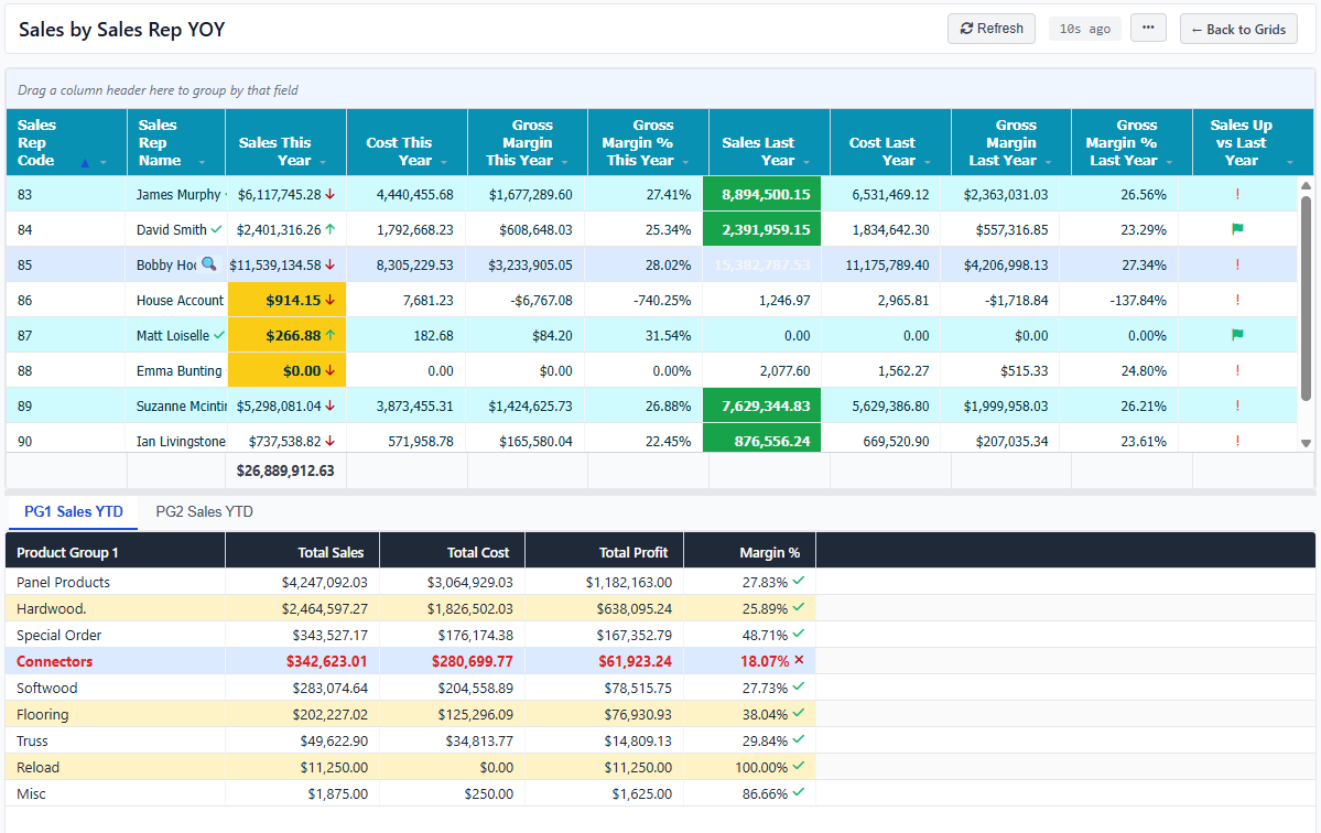
Follow a real example — a Sales by Sales Rep grid with conditional formatting, drill-down Data Cards, and a preview pane — from designer to mobile.
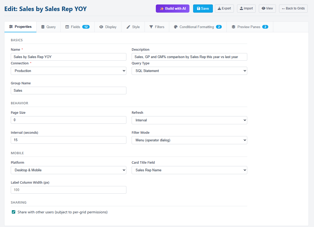
Open the designer.
Click New Grid and you land on a tabbed designer — Properties, Query, Fields, Filters, Conditional Formatting, Preview Panes, and Styling. Pick which connection the grid runs against, give it a name, and choose a Platform: Desktop, Mobile, or both.
Connections come from Hook-Tech One. Each connection has its own schema — a grid is bound to one, and drill-down Data Cards have to come from the same connection.
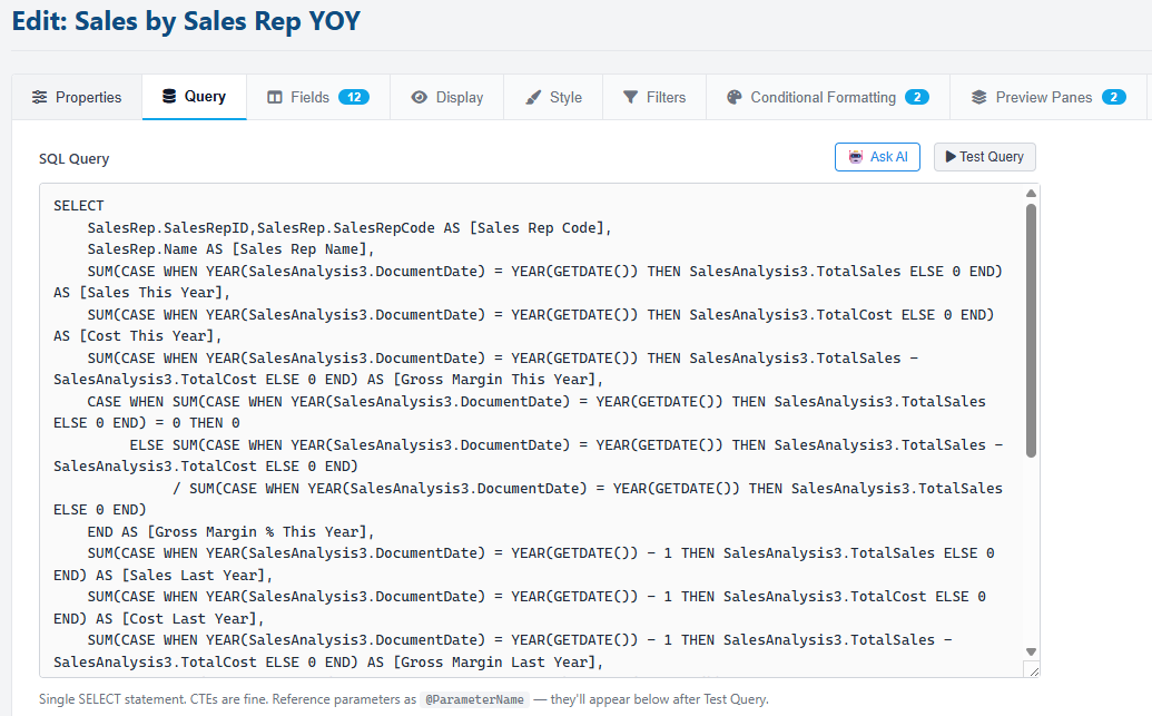
Plain SQL — or describe it in English.
The Query tab takes any SQL — plain text or a stored procedure. Use @ParameterName tokens for anything that should be filterable. Hit Test to run the query and inspect the columns and a sample of rows.
Or skip the writing entirely — click Ask AI and describe what you want: "Sales TY and LY by sales rep, with margin and YoY change". The AI uses your AI Schema from Hook-Tech One to write accurate SQL against your real tables.
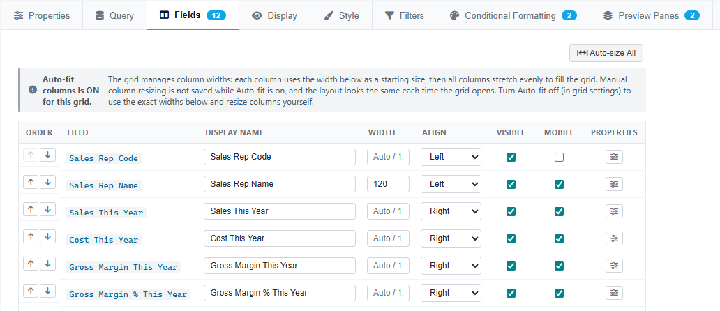
Fields, formats, and per-cell rules.
The Fields tab lists every column the query returned. For each one set the display name, width, alignment, number format (currency, percentage, date), visibility, and a mobile-specific label for narrow screens.
Drill into Field Properties for the deeper controls — icon rules that swap text for a coloured arrow or flag, boolean display, and the drill-down link to a Data Card.
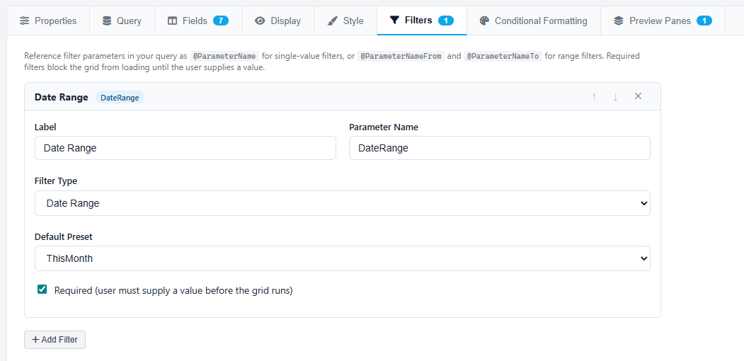
Ten filter types, one consistent UX.
Filters live at the top of the viewer and feed the query's @-parameters. Pick from Date Range with presets, Single Date, Text, Numeric, Number Range, Custom Dropdown, SQL Dropdown, SQL Multi-select, and Global Filter references to Hook-Tech One's shared filter library.
Each filter has a default value and an optional required flag. If a required filter has no value, the grid waits for the user to fill it in before running — protecting against multi-million-row scans by accident.
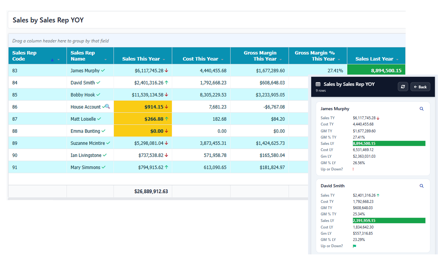
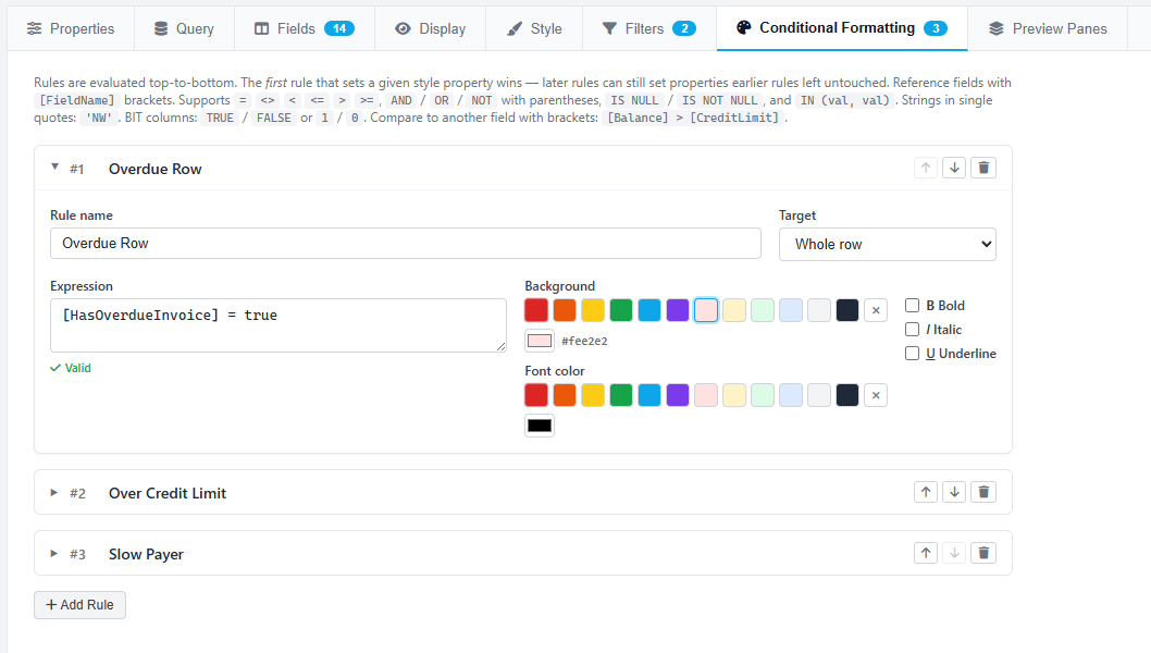
Conditional formatting per cell or per row.
Every grid can have any number of conditional format rules. Each rule is an expression — SalesYTD > 100000, InvoiceDate < Today() - 90 — plus a target (a specific cell or the whole row) and a style: fill colour, foreground, bold, italic.
Rules evaluate in sort order — first match per property wins — so most-specific rules first. The result is a table that reads at a glance: green rows for paid, amber for overdue, a red flag in the cell where margin slipped below threshold.
Data Cards and Preview Panes.
Wire any field to a Data Card — a reusable popup that shows one row in detail with optional sub-tables — and that field's cells render with a magnifying-glass icon at run time. Click and the card opens with parameters resolved from the clicked row.
Or add a Preview Pane — a smaller grid docked beside or below the parent that re-runs every time the user selects a row. Map which parent fields flow into which child parameters, and the parent's filter values pass through automatically.
Live, interactive, and mobile-ready.
Save and the grid is live. The viewer gives users column sort, row grouping, per-column quick filters, and Excel / CSV export. Everything is interactive against live SQL — change the filter, hit Apply, the table re-queries.
On a phone, the same grid renders as tap-friendly cards with a Card Title field as the heading. Drill icons still appear next to fields that have Data Card links, and the filter bar collapses to a compact toggle at the top.